This notebook provides an introduction to Geovisualization using Python. Both the Matplotlib family and HTML-based visualization are covered. This notebook was created by Becky Vandewalle based off of prior work by Dandong Yin.
Notebook Outline:
Introduction
Visualization is an important technique to be familiar with to visualize geospatial data and analysis results. There are quite a few ways to visualize geospatial data using Python, both using extensions to existing plotting capabilities and through specialized geospatial libraries.
Some useful documentation is listed here:
Official introductory tutorials for Matplotlib https://matplotlib.org/tutorials/index.html#introductory
A relatively-short Matplotlib tutorial http://www.labri.fr/perso/nrougier/teaching/matplotlib/matplotlib.html
Quick Matplotlibgraphic reference https://www.stat.berkeley.edu/~nelle/teaching/2017-visualization/README.html#quick-references
All basemap methods: https://basemaptutorial.readthedocs.io/en/latest/#all-basemap-methods
Basemap examples: https://matplotlib.org/basemap/users/examples.html
Cartopy library docs (advanced plotting based on Matplotlib and basemap) https://scitools.org.uk/cartopy/docs/v0.15/matplotlib/advanced_plotting.html
!pip install --user mapclassify
# aftrer installation, you need to restart kernel
# import required libraries

%matplotlib inline
import os
from datetime import datetime

# set environment variable needed for basemap

os.environ["PROJ_LIB"] = r'/opt/conda/pkgs/proj4-5.2.0-he1b5a44_1006/share/proj/'

import numpy as np
import mpl_toolkits

import pandas as pd
import geopandas as gpd
from geopandas import GeoSeries, GeoDataFrame
from shapely.geometry import Point

#import mapclassify
import matplotlib.pyplot as plt
import matplotlib.patches as patches
from mpl_toolkits.basemap import Basemap


import json
import folium
import mplleaflet
Matplotlib
Matplotlib is a graphic workhorse for Python and is commonly used for graphs and figures. The %matplotlib inline function helps plots to display properly in Jupyter Notebooks.
%matplotlib inline
Plot a simple function. The ; is used to suppress Matplotlib's written output.
# plot 0 - 9

plt.plot(range(10));

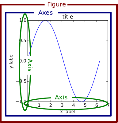
Basic Plot Framework
A basic Matplotlib plot contains a Figure, Axes, a Title, and Labels.
It is also possible to include multiple axes in one figure. This image shows three axes.
![]()
Plotting with Style
Using different plotting character keys in the plot function's second argument, you can plot different styles of lines and symbols using different colors.
In the following plot, '+' indicates the symbols should be shaped like crosses, 'r' tells Matplotlib to plot the line in red, and '--' says the line should be dashed.
plt.plot(range(10), '+r--', markersize=10, label='inc');

Here are a few more examples:
plt.plot(range(10)[::-1], 'b*:', label='dec')
plt.plot([4.5]*10, 'gx-', label='fix')
plt.plot(range(10), 'ko-', label='ver')
plt.legend();

Plotting Shapes
You can also draw shapes on a plot using patches.
plt.plot(range(10))
plt.gca().add_patch(patches.Circle((5, 5), 2, edgecolor='red', facecolor='none'))
plt.gca().add_patch(patches.Rectangle((0, 0), 9, 9, linewidth=10, edgecolor='cyan', facecolor='none'));

A good reference for Matplotlib plotting can be found here.
Plotting with Numpy
Numpy is a Python library that has some useful functions for dealing with number sequences. Below is an example of plotting functions using Matplotlib from a Numpy array.
# evenly sampled time at 200ms intervals
t = np.arange(0., 5., 0.2)

# red dashes, blue squares and green triangles
plt.plot(t, t, 'r--', t, t**2, 'bs', t, t**3, 'g^');

Here is an example using random number generation features.
data = {'a': np.arange(50),
        'c': np.random.randint(0, 50, 50),
        'd': np.random.randn(50)}
data['b'] = data['a'] + 10 * np.random.randn(50)
data['d'] = np.abs(data['d']) * 100

plt.scatter('a', 'b', c='c', s='d', data=data)
plt.xlabel('entry a')
plt.ylabel('entry b');

More Plotting Control
Knowing the Elements of a Plot can allow you to adjust the plot layout with more fine control. Here are important parts of a plot!

Using these we can fine tune labels and line widths for the following histogram.
plt.figure(figsize=(12,10))

mu, sigma = 100, 15
x = mu + sigma * np.random.randn(10000)

n, bins, _ = plt.hist(x, 50, density=1, facecolor='g', alpha=0.75)
plt.xlabel('Value', fontsize=22)
plt.ylabel('Probability', fontsize=22)
plt.title('Histogram', fontsize=22)
plt.tick_params(labelsize=20)
plt.text(60, .025, r'$\mu=100,\ \sigma=15$', fontsize=22)
plt.axis([40, 160, 0, 0.03])
plt.grid(True)

Introducing Basemap
Basemap is a library for plotting maps in Python. It handles dealing with coordinate projections, plots user-specified data using Matplotlib, and gathers and clips datasets to draw in the background.
Once you set up a Basemap, you can call different functions, such as the drawcoastlines function to add layers to the map.
The cell below initiates a Basemap by designating projection, resolution, window extent and coordinates.
# set initial values

bmap = Basemap(width=12000000,height=9000000,projection='lcc',
            resolution='c',lat_1=45.,lat_2=55,lat_0=50,lon_0=-107.)
Nothing is plotted yet. We can see the type of bmap below.
bmap
Now we can start adding to the map:
# draw coastlines

bmap.drawcoastlines();

By adding a blue background, we can simulate oceans.
# set up map

bmap = Basemap(width=12000000,height=9000000,projection='lcc',
            resolution='c',lat_1=45.,lat_2=55,lat_0=50,lon_0=-107.)
bmap.drawcoastlines()

# set map background to blue

bmap.drawmapboundary(fill_color='aqua');

Finally we can color the continents so that it looks like they are on top of the ocean.
# set up map

bmap = Basemap(width=12000000,height=9000000,projection='lcc',
            resolution='c',lat_1=45.,lat_2=55,lat_0=50,lon_0=-107.)
bmap.drawcoastlines()
bmap.drawmapboundary(fill_color='aqua')

# fill continents, set lake color same as ocean color.

bmap.fillcontinents(color='coral',lake_color='aqua');

Basemap Backgrounds
Several types of preloaded map style options are available in Basemap. Here are a few examples:
Blue Marble:
bmap = Basemap(width=12000000,height=9000000,projection='lcc',
            resolution=None,lat_1=45.,lat_2=55,lat_0=50,lon_0=-107.)
bmap.bluemarble();

Shaded Relief:
bmap = Basemap(width=12000000,height=9000000,projection='lcc',
            resolution=None,lat_1=45.,lat_2=55,lat_0=50,lon_0=-107.)
bmap.shadedrelief();

ETOPO1 Global Relief Model:
bmap = Basemap(width=12000000,height=9000000,projection='lcc',
            resolution=None,lat_1=45.,lat_2=55,lat_0=50,lon_0=-107.)
bmap.etopo();

Projecting with Basemap
Basemap handles different projections with the projection parameter in the basic basemap. It is fairly easy to draw parallels and meridians with Basemap.
This first map has a Lambert Conformal projection, indicated by lcc.
# setup Lambert Conformal basemap

m = Basemap(width=12000000,height=9000000,projection='lcc',
            resolution='c',lat_1=45.,lat_2=55,lat_0=50,lon_0=-107.)

m.drawcoastlines()
m.drawmapboundary(fill_color='aqua')
m.fillcontinents(color='coral',lake_color='aqua')

# draw parallels and meridians

parallels = np.arange(0.,81,10.)
m.drawparallels(parallels,labels=[False,True,True,False])

meridians = np.arange(10.,351.,20.)
m.drawmeridians(meridians,labels=[True,False,False,True]);

This next map has a Miller projection, indicated by mill. This also shows how you can incorporate shading to indicate daylight throughout the map.
# create a map with the Miller projection

m = Basemap(projection='mill',lon_0=180)

# plot coastlines, draw label meridians and parallels.
m.drawcoastlines()
m.drawparallels(np.arange(-90,90,30),labels=[1,0,0,0])
m.drawmeridians(np.arange(m.lonmin,m.lonmax+30,60),labels=[0,0,0,1])

# fill continents 'coral' (with zorder=0), color wet areas 'aqua'
m.drawmapboundary(fill_color='aqua')
m.fillcontinents(color='coral',lake_color='aqua')

# shade the night areas, with alpha transparency so the
# map shows through. Use current time in UTC.
date = datetime.utcnow()
CS = m.nightshade(date)

plt.title('Day/Night Map for %s (UTC)' % date.strftime("%d %b %Y %H:%M:%S"));

Plotting over Basemap
The real power of Basemap comes from plotting your data over it!
Here, random integers are plotted and connected on top of a Basemap.
lats = np.random.randint(-75, 75, size=50)
lons = np.random.randint(-179, 179, size=50)

fig = plt.gcf()
fig.set_size_inches(8, 6.5)

m = Basemap(projection='merc', \
            llcrnrlat=-80, urcrnrlat=80, \
            llcrnrlon=-180, urcrnrlon=180, \
            lat_ts=20, \
            resolution='c')

m.bluemarble(scale=0.2)   # full scale will be overkill
m.drawcoastlines(color='white', linewidth=0.2)  # add coastlines

x, y = m(lons, lats)  # transform coordinates

plt.plot(x,y,'ro:');

On this next map, a great circle route is calculated and visualized.
fig=plt.figure(figsize=(12,6))

# setup mercator map projection.
m = Basemap(llcrnrlon=-100.,llcrnrlat=20.,urcrnrlon=20.,urcrnrlat=60.,\
            resolution='l',projection='merc',\
            lat_0=40.,lon_0=-20.,lat_ts=20.)
m.drawcoastlines()
m.fillcontinents(zorder=0)


# nylat, nylon are lat/lon of New York
nylat = 40.78; nylon = -73.98

# lonlat, lonlon are lat/lon of London.
lonlat = 51.53; lonlon = 0.08

# draw great circle route between NY and London
m.drawgreatcircle(nylon,nylat,lonlon,lonlat,linewidth=2,color='b')

m.scatter(nylon, nylat, s=500, latlon=True)
m.scatter(lonlon, lonlat, s=500, latlon=True)

# draw parallels
m.drawparallels(np.arange(10,90,20),labels=[1,1,0,1])

# draw meridians
m.drawmeridians(np.arange(-180,180,30),labels=[1,1,0,1])

plt.title('Great Circle from New York to London')
print (plt.xlim(), plt.ylim())

GeoPandas, Brielfy
GeoPandas is a Python library used for working with Geospatial data. We'll only look at it briefly here to see how it works with Basemap.
Learn more about GeoPandas in this notebook!
Plot a simple series of points:
# plot a geoseries

gs = GeoSeries([Point(-120, 45), Point(-121.2, 46), Point(-122.9, 47.5)])
gs.crs = {'init': 'epsg:4326'}
gs.plot(marker='*', color='red', markersize=100, figsize=(4, 4));

Combining GeoPandas and Basemap
This is an example of a map that combines GeoPandas and Basemap.
# plot geoseries over basemap

m = Basemap(llcrnrlon=-125.,llcrnrlat=43.,urcrnrlon=-118.,urcrnrlat=48.,\
            resolution='l',epsg=4326)
m.drawparallels(np.arange(42,50,2),labels=[1,0,0,1])
m.drawmeridians(np.arange(-125,-115,2),labels=[1,0,0,1])
m.drawcoastlines()
m.fillcontinents(zorder=0)
gs.plot(ax=plt.gca(), marker='*',color='red', markersize=100);

ProblemExample: The Massachusetts Dataset
Here lets look at taking a dataset and displaying it with Python.
First we'll import the data from a shapefile:
# read data from shapefile

mass_shp = gpd.read_file(os.path.join('./pyintro_resources/data','towns.shp'))
type(mass_shp)
Now lets inspect the file:
# read first lines

mass_shp.head()
We can fairly easily plot the data using the GeoDataFrame.plot method!
mass_shp.plot();

We can then expand on the basic plot:
##mass_shp.plot(column='POP2010', cmap='rainbow', legend=True, scheme='Fisher_Jenks', k=10, figsize=(12,8),legend_kwds={'loc':'lower left'})
## question for the two parameters: scheme and legend_kwds
import mapclassify
mass_shp.plot(column='POP2010',cmap='rainbow',legend=True,k=10,figsize=(12,8),scheme='Fisher_Jenks',legend_kwds={'loc':'lower left'})
plt.title('2010 Population Distribution in Massachusetts', fontsize=20)
print (plt.xlim(), plt.ylim())

It can be useful to know the coordinate reference system for our data:
mass_shp.crs
Now we can plot our data using Basemap (Note that this is low quality, but higher quality Basemap datasets can be installed).
plt.figure(figsize=(12,10))
m = Basemap(llcrnrlon=-73.5,llcrnrlat=41.0,urcrnrlon=-69.5,urcrnrlat=43.,
            resolution = 'l', epsg=26986)
m.drawparallels(np.arange(41, 43, 0.5),labels=[1,0,0,1])
m.drawmeridians(np.arange(-73, -69, 1.),labels=[1,0,0,1])
m.drawcoastlines()
m.drawstates()
m.fillcontinents(zorder=0)

mass_shp.to_crs(m.proj4string).plot(column='POP2010', cmap='rainbow', legend=True,
                                    scheme='Fisher_Jenks', k=10, figsize=(12,8),
                                    legend_kwds={'loc':'lower left'}, alpha=0.5,
                                    ax=plt.gca())

plt.title('2010 Population Distribution in Massachusetts', fontsize=20);

Problem: Moving to the Web
Sometimes it can be useful to have an interactive web map that allows you to zoom in and out, toggle layers, and otherwise interact with the data. Two particular libraries, mplleaflet and folium come in handy here!
mplleaflet easily converts Matplotlib blots to Leaflet webmaps. folium is used to display data in Leaflet webmaps.
Learn more about mplleaflet https://github.com/jwass/mplleaflet
Introduction to Leaflet https://leafletjs.com/
folium documentation https://python-visualization.github.io/folium/
Plotting with mplleaflet
To demonstrate how easily mplleaflet works, here is a simple plot using Matplotlib.
# basic plot

plt.plot(range(10), 'b')
plt.plot(range(10), 'rs');

With one extra line in mplleaflet, we can convert this to an interactive Leaflet map!
# basic plot - now interactive

plt.plot(range(10), 'b')
plt.plot(range(10), 'rs')
mplleaflet.display()
Now, lets make an interactive map using the Chicago Community dataset.
# read in data

df = gpd.read_file(os.path.join('./pyintro_resources/data', 'Chicago_Community.geojson'))
# display columns

df.columns
What does a regular plot look like?
# plot the first 50 communities

ax = df.head(50).plot(cmap='tab10')

# plot interactively

mplleaflet.display(fig=ax.figure, crs=df.crs)
Here is another example:
ax=df.plot(cmap='tab10')

This saves the map to an HTML File.
mplleaflet.show(fig=ax.figure, crs=df.crs, tiles='cartodb_positron', path='chicago.html')
Now we can load the HTML file into an iframe for display.
%%html
<iframe src='chicago.html' width=1000 height=600/>

Plotting with folium
folium can create some truly stunning interactive webmaps.
Here is a basic example:
# map centered on a specific location

m = folium.Map(location=[40.1080246,-88.2259164],zoom_start=17)
m
You can easily save a map to an HTML file using the save function.
# save the map as HTML

m.save('folium-quad.html')
You can quickly change the base map style:
folium.Map(location=[40.1080246,-88.2259164], tiles='Stamen Toner', zoom_start=17)
You can easily add markers with popups descriptions tooltip windows. The add_to function allows you to add additional content to a base map.
# hover over markers to see tooltip

m = folium.Map(location=[40.1094763,-88.2261033], zoom_start=17, tiles='Stamen Terrain')

tooltip = 'Click me!'
folium.Marker([40.1094763,-88.2261033], popup='<i>Natural History Building</i>', tooltip=tooltip).add_to(m)
folium.Marker([40.1094375,-88.2271792], popup='<b>Illini Union</b>', tooltip=tooltip).add_to(m)
m
Folium also makes it easy to change marker styles.
# change marker style

m = folium.Map(location=[40.1094763,-88.2261033], zoom_start=17, tiles='Stamen Terrain')
folium.Marker(location = [40.1094763,-88.2261033], popup = 'Natural History Building',
              icon = folium.Icon(icon = 'cloud')).add_to(m)
folium.Marker(location = [40.1094375,-88.2271792], popup='Illini Union',
    icon = folium.Icon(color = 'green')).add_to(m)
folium.Marker(location=[40.1092067,-88.2266318], popup='Harker Hall',
    icon=folium.Icon(color='red', icon='info-sign')).add_to(m)
m
It is simple to add shapes to a map as well.
# plot circles

m = folium.Map(location=[40.1094763,-88.2261033], tiles='Stamen Toner', zoom_start=13)

folium.Circle(radius=100, #meters
    location=[40.107578, -88.227182], popup='The Quad', color='crimson',fill=False,).add_to(m)
folium.CircleMarker(location=[40.117955, -88.242498],
    radius=30, #screen pixels, remains constant when zoomed out
    popup='Downtown Champaign', color='#3186cc', fill=True, fill_color='#3186cc'
).add_to(m)
m
Other types of interactive features can be added, such as location aware pop ups. Click the map to see the latitude and longitude values!
# add lat/long popup on click

m = folium.Map(location=[40.1094763,-88.2261033], tiles='Stamen Terrain', zoom_start=12)
m.add_child(folium.LatLngPopup())
m
Similarly, you can also interactively add things like markers.
# Add markers on click

m = folium.Map(location=[46.8527, -121.7649], tiles='Stamen Terrain', zoom_start=13)
folium.Marker([46.8354, -121.7325], popup='Camp Muir').add_to(m)
m.add_child(folium.ClickForMarker(popup='Waypoint'))
m